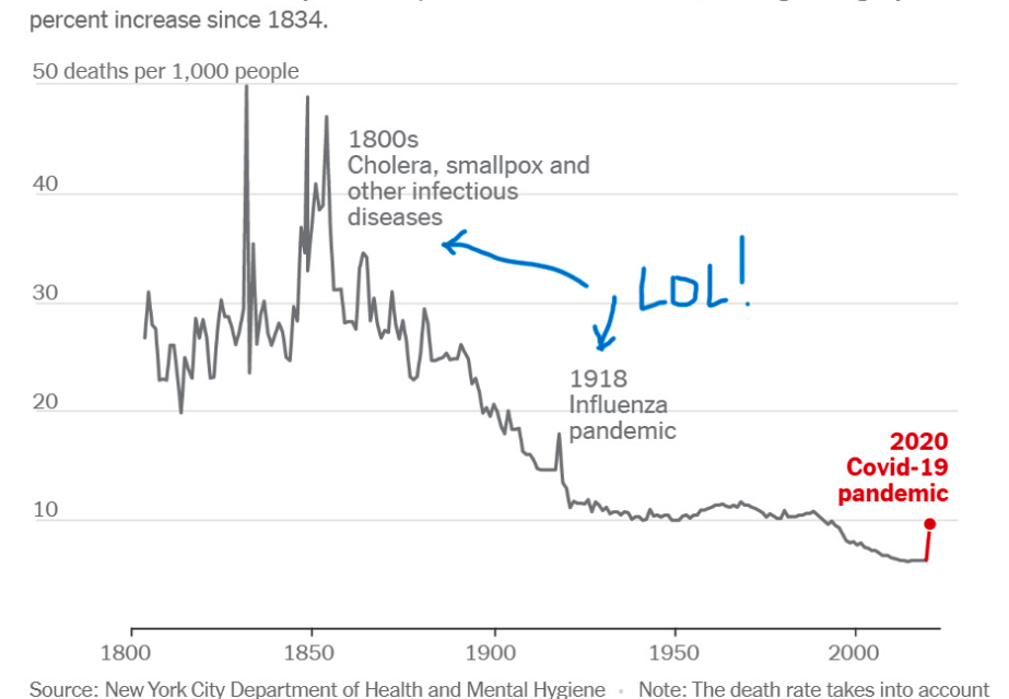
The COVID Con explained in one chart
NYC had 60 to 70 consecutive years in the 20th century with a HIGHER death rate from infectious disease deaths than the peak of the COVID scamdemic
A useful chart from Sasha Latypova about something Brasscheck has been talking about since 2020
Click here to support: The Real Food Channel
I strive to cut to the heart of things and make them as simple as humanly possible.
This single chart pretty much explains everything.
Click here to support: The Real Food Channel
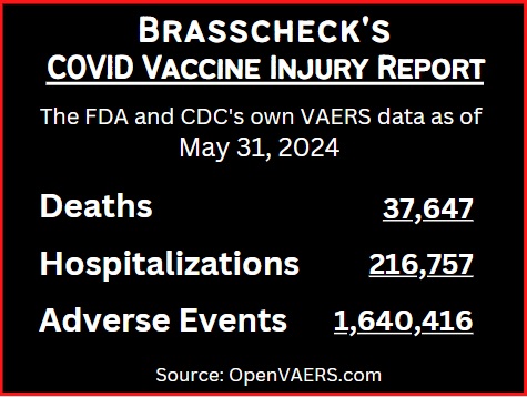
Brasscheck Books:


Censorship
Amazon #1
Political Freedom
Amazon #1
Law Ethics
& Responsibility

New Release
Financial Risk
Management
Amazon #1
New Release
Options Trading
Amazon #3
Best Seller
Business Ethics

Amazon #1
Human Rights Law
Amazon #1
Law Ethics &
Responsibility